Since I remove my posts in 48 hours, I’m not trying to get followers. But if you are, I think if you follow someone else, they will be courteous enough to follow you back. I’m surprised I have any “followers” at all! LOL! Try using different “tags” as well…expand the definition of your writing and cast a wider net. Let me know how it goes!
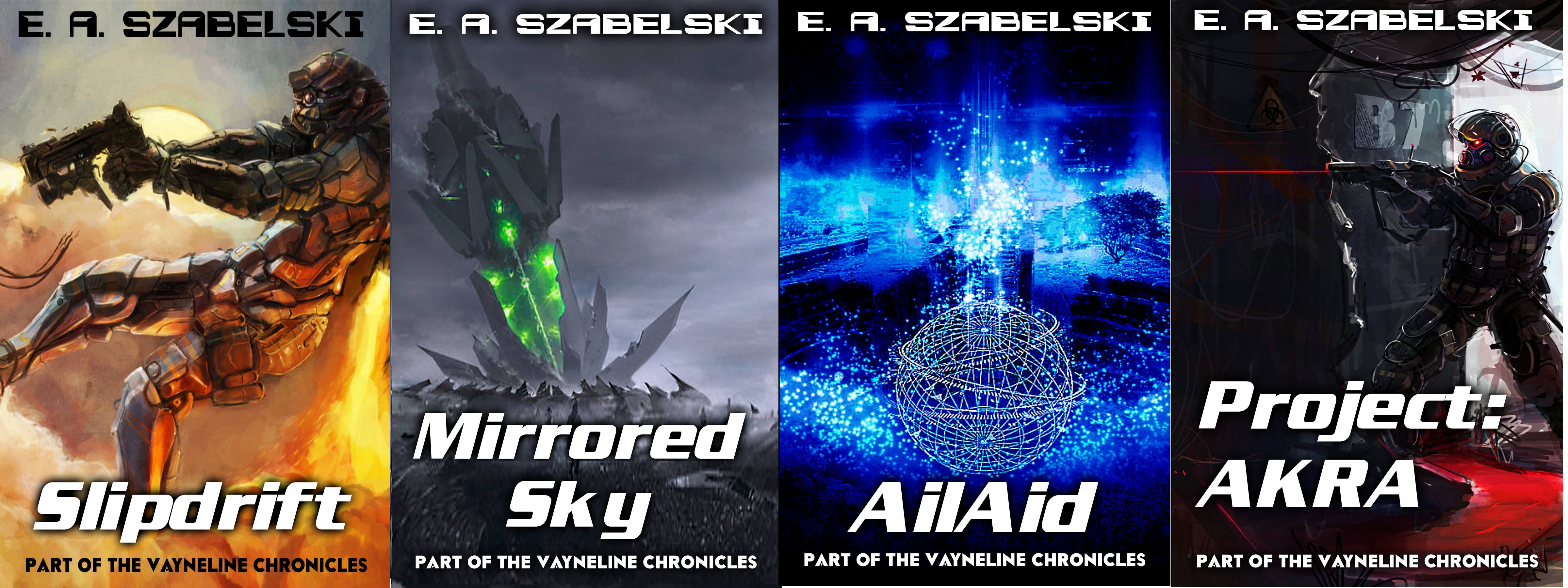


They look good. Have you looked at centering the titles on the cover vertically? Hey, I’m no guru. It was just a thought.
LikeLike
Oh, yeah it was mostly me doing it myself.
LikeLike
AWESOME!!!!
LikeLike
Thanks. Whats new with you?
LikeLiked by 1 person
Paul morphed into a buncha Monarch butterflies…next post up in a few days…my followers growing. Love your artwork bro!
LikeLike
Congrats on your books I hope they become “collectables.” I’m very excited for you!!
LikeLike
Thanks man, its slow. What do you do for getting more followers?
LikeLiked by 1 person
Write more exciting stories. I’ve been missing your presence!
LikeLike
Ok thanks for the impetus. I will start right now with a story segment.
LikeLiked by 1 person
Since I remove my posts in 48 hours, I’m not trying to get followers. But if you are, I think if you follow someone else, they will be courteous enough to follow you back. I’m surprised I have any “followers” at all! LOL! Try using different “tags” as well…expand the definition of your writing and cast a wider net. Let me know how it goes!
LikeLike